

How to Choose Authentically Diverse Images for Your Presentation
As a designer, it’s now more imperative than ever to design with inclusivity and diversity in mind. This is not to be confused with designing for people with disabilities or for a certain group/race of people.
This is about designing with all people in mind and resonating with a wide range of people including persons of color, LGBTQ+, disabilities, age, sex, and etc. It’s important to have a sense of empathy when choosing images and designing for inclusivity, especially in the landscape of presentations.
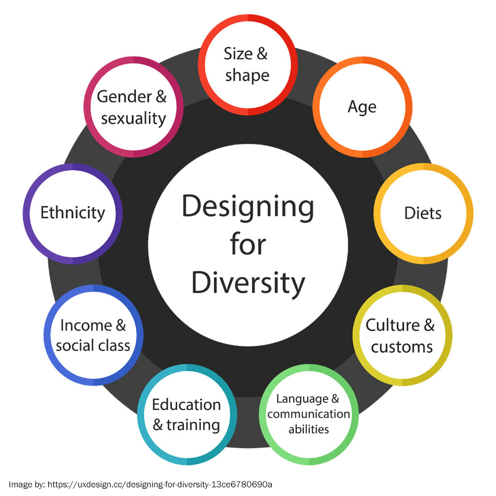
Here is a diagram that may help you when thinking about inclusivity and diversity in design:
Common Pitfalls When Designing for Diversity and Inclusion
In the past, most of the advertising and design was geared for the “average man” and many had a “one size fits all” approach. In 2021, we know that individuality and curated experiences are key for marketing in the 21st century. It’s about how you can narrow your niche to include not only “everyone who matters” but the groups that have been underrepresented in the past.
Ideas for Sourcing Diverse and Inclusive Images
What’s important to note and think about when choosing images for inclusion or diversity, is that we cannot just fit people into neat categories and boxes anymore. Everyone falls on different ranges of every spectrum out there and that landscape is multi-dimensional.
When choosing images, especially for a Powerpoint presentation, it’s important to choose images that look and feel genuine. It’s not about including photos of certain groups for the sake of being inclusive, it’s about making sure everyone feels represented and accepted. Be aware of stereotypes when reviewing images for presentations.
For example, consider the types of images that come up on a stock photo search. Do the images support outdated stereotypes like a woman cooking in the kitchen or a group of men in a corporate business setting? Do all of the images of “fitness” only show people who are thinner or muscular? These are stereotypical biases to keep in mind when sourcing images for diverse and inclusive copy.
Intention vs. Impact
One philosophy that many of the major corporations such as T-Mobile, Target, Amazon, and Microsoft have adopted into their D&I design strategy is the position of intention vs impact.
This is an important concept when developing any kind of advertising or marketing strategy, as you want to portray your intended message while being aware of the potential impact of that information on several different groups of people.
It’s always important to remember, “Who isn’t represented here?” and “What kind of impact might this have on my audience?” when reviewing images and copy for presentations and other communications.
Best Practices and Future Design Predictions
In the common media culture, we are trained to view able-bodied and fit Caucasian men and women as the main subject of photography and visual media presented to the masses. This is no longer acceptable to present only these types of images in presentations and when considering diversity and inclusion in design practices.
When reviewing your images and copy for diversity and inclusion, be sure to note your own biases and weak spots when choosing content. Remember, you are not designing for yourself, you are designing for an entire audience of diverse people.
These practices should help you get started in designing with diversity and inclusivity in mind and move us all closer to a more equally represented culture.